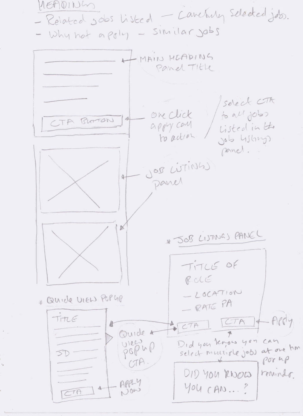
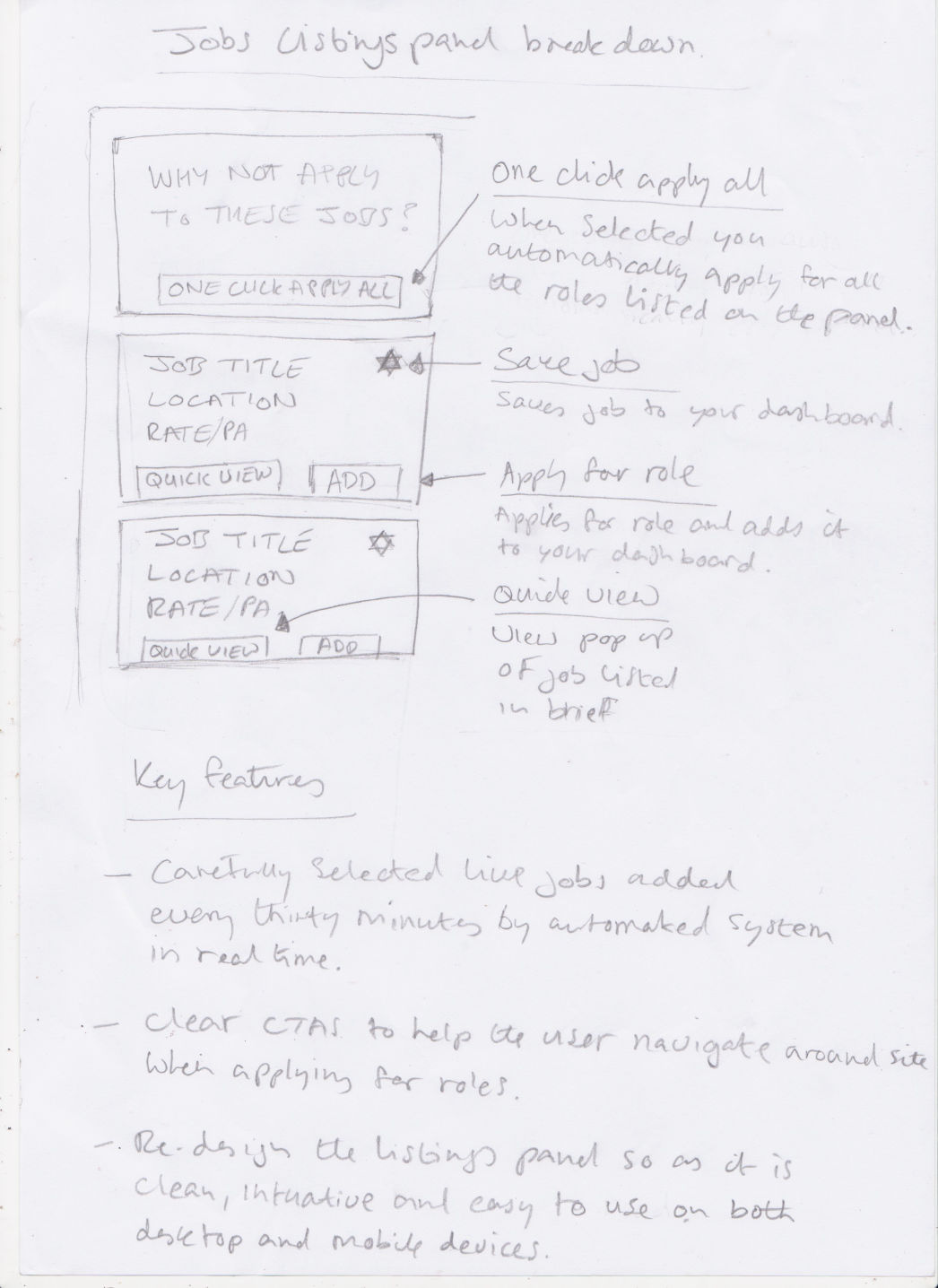
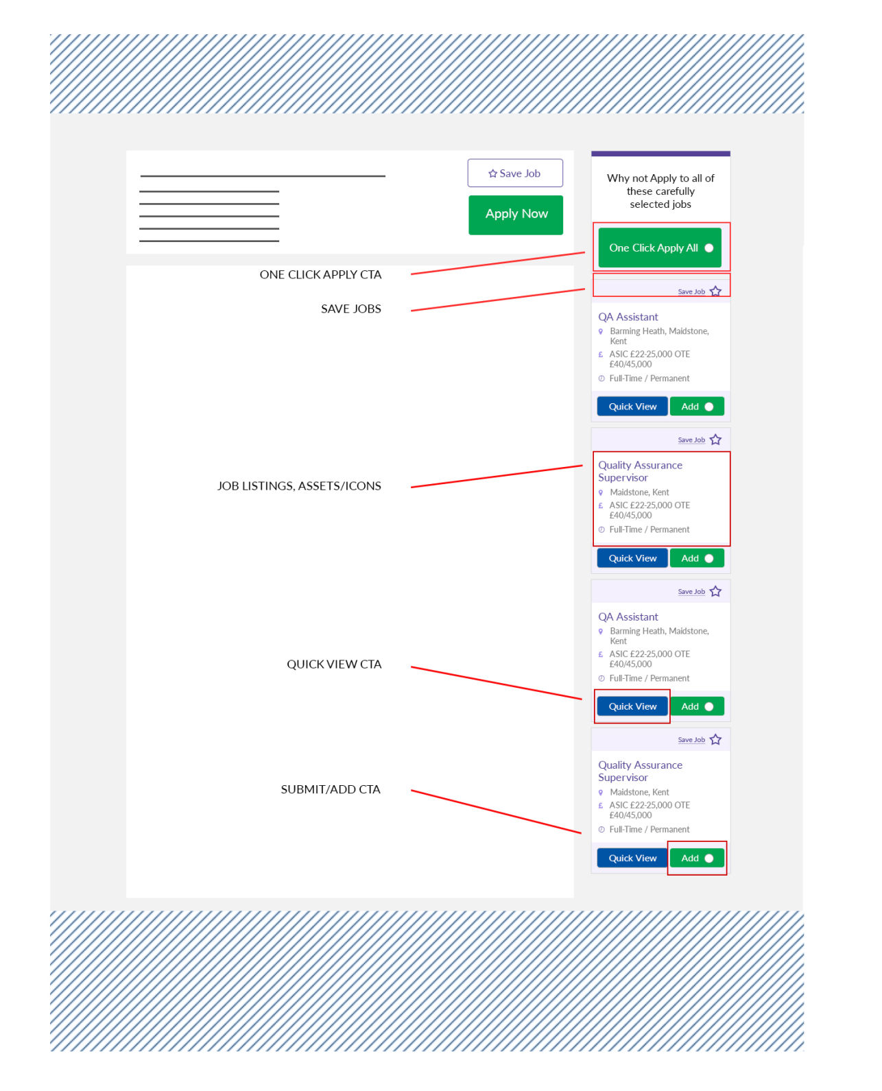
One Click Apply All CTA
This feature empowers users to apply for all jobs listed in the panel with a single click, significantly streamlining the application process.
Created in 1999, JobsInKent.com is the longest established recruitment web site specifically focusing on Kent. JobsInKent.com is by far Kent's largest job site receiving over 25 million hits in October 2018 from Kent based jobseekers.
The existing Jobs Listings Panel on the Kent Jobs website was underperforming due to a lack of user engagement and essential features, as highlighted by analytics and user testing.
To enhance the panel's user-friendliness and effectiveness, transforming it into a more valuable tool for job seekers.
Implementing key improvements designed to simplify and streamline the job search experience, making the panel more appealing, engaging, and intuitive to use.
A revitalized Jobs Listings Panel that empowers users to effortlessly find the perfect job opportunity within Kent.
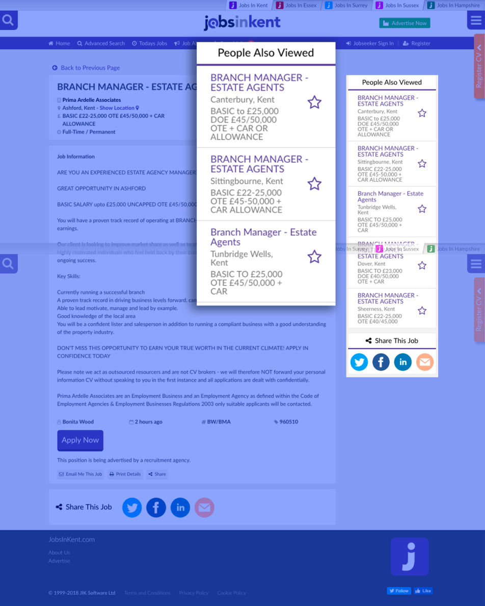
The Jobs Listings Panel, initially conceived as a dynamic tool to connect job seekers with real-time opportunities, faced challenges in achieving its full potential. Originally titled "People Also Viewed," the panel lacked consistent user engagement and failed to highlight crucial functionalities, ultimately impacting application rates.
The original design offered the undeniable advantage of showcasing new job postings as they appeared. This allowed users to swiftly react, either by immediately applying or saving promising positions for future consideration. This real-time aspect was intended to create a sense of immediacy and empower users to stay ahead of the competition.
Despite the real-time advantage, the initial iteration suffered from significant drawbacks. With only two call-to-action buttons - one for viewing the full job description and the other for saving the job – the panel presented a limited range of interaction. Crucially, analytics data revealed a low conversion rate from saved jobs to actual applications. Users rarely revisited or applied to jobs they had saved, indicating a disconnect between the "save" function and the ultimate goal of securing employment.
This underperformance rendered the panel ineffective and, ultimately, redundant. Its limited functionality and low application conversion negatively impacted overall user engagement and the platform's effectiveness in connecting candidates with relevant job opportunities on a weekly and monthly basis. The need for a redesign became clear: the panel had to evolve to better serve its intended purpose and drive meaningful user action.
This feature empowers users to apply for all jobs listed in the panel with a single click, significantly streamlining the application process.
Enables users to save jobs to their personal dashboard for easy access and future application. This feature allows for convenient management of desired positions.
This section utilises a clean layout with relevant icons to clearly highlight key details. Location, salary, and duration are consistently presented in a recognisable format, adhering to modern web standards for optimal readability and scalability.
The Quick View Tab provides a concise overview of the role, salary, and location, enabling users to quickly assess the most important details without navigating to a separate page. Note: This feature was deactivated for mobile due to navigation challenges with pop-ups on smaller screens.
Users have the option to apply for all roles simultaneously using the "One Click All" button or individually add roles to their Saved Jobs Panel by utilising the "Add" CTA button for each specific job listing.


Mobirise