Microsites & Landing Pages

Advertising - Promotions - Campaigns

The Projects

Creating compelling microsites and landing pages that connect with the
clients audience.

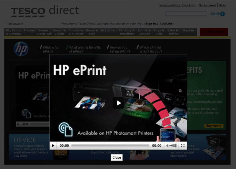
HP ePrint - Tesco Direct

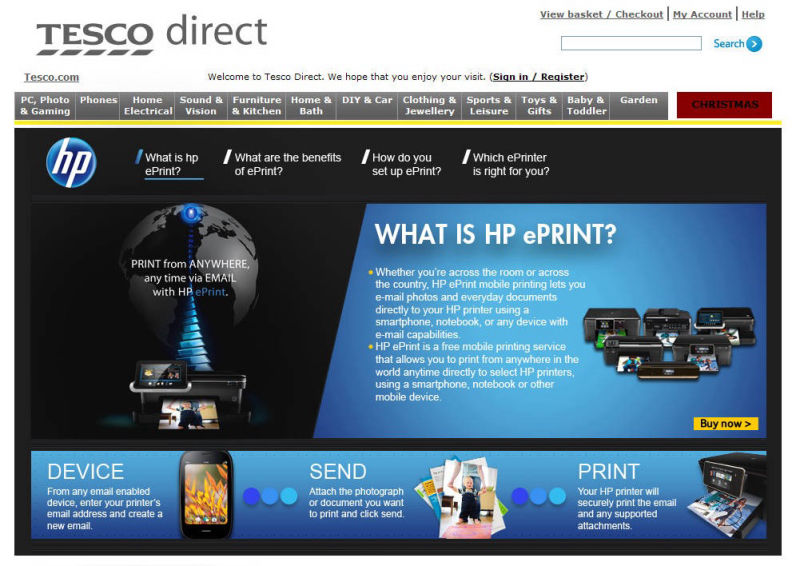
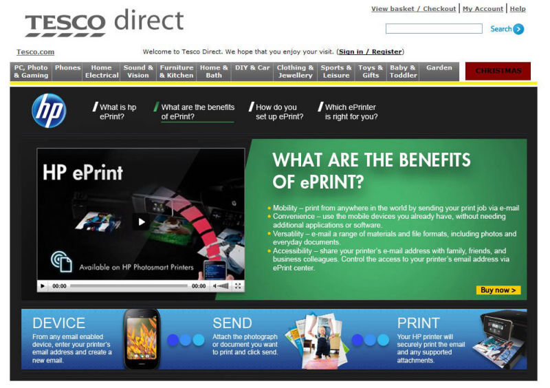
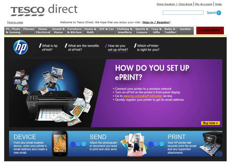
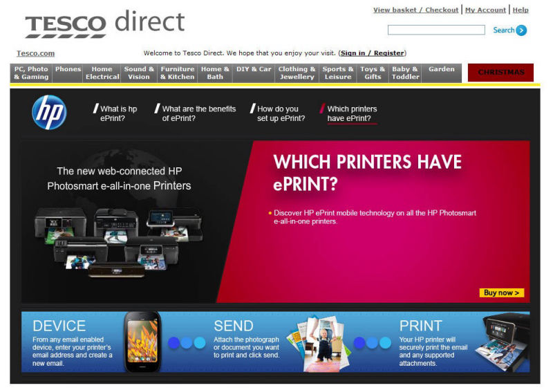
Hewlett Packard hired Tesco to design a microsite to promote their new ePrint line of printers and sell them on the Tesco Direct website.

The microsite showcased HP's new line of technologically advanced Wi-Fi enabled printers, designed to deliver unparalleled printing capabilities in today's connected world. The aim of a microsite was to provide focused content that enhanced a specific product. An effective microsite utilises captivating visuals, clear messaging, and seamless navigation to immerse visitors in a compelling experience. The objective was to highlight HP's new products to help deliver relevant, engaging content to niche audiences. 

The microsite created an immersive experience for visitors through the use of animated banners that brought visuals to life. By incorporating motion and visual flair, the banners captured attention and enhanced engagement in a professional yet captivating way. The animations added energy and dynamism that made the content more memorable and impactful for the audience. Overall, the animated banners elevated the visual aesthetics of the microsite and created a more vibrant, eye-catching visit for users.

Silentnight - Tesco Direct

Silentnight had a vision for a microsite that would showcase their new line of mattresses on Tesco Direct in an immersive way. Rather than just displaying products, they wanted to provide an experience - with engaging video content and informative details about each mattress, presented seamlessly without excessive clicking. 

Leveraging the strong branding of both Tesco and Silentnight, the final design brought this vision to life. The microsite invited customers into the world of Silentnight, using compelling visuals and storytelling to highlight the key features and benefits of their mattresses. The result was an online destination that captured attention and drove interest in an impactful yet effortless way for visitors.

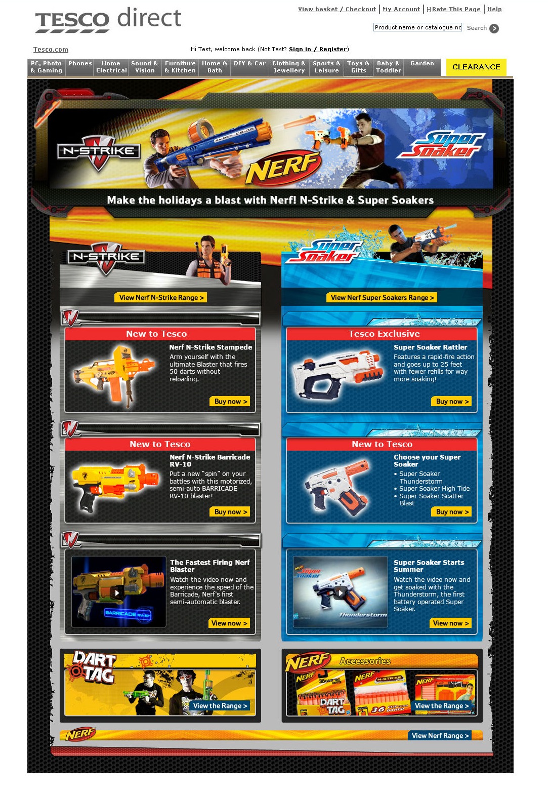
Hasbro Nerf - Tesco Direct

When Hasbro asked Dunnhumby to create a new microsite concept for their beloved Nerf brand, I rose to the challenge and dove headfirst into researching everything Nerf. I pored over team pages, watched product videos, and absorbed the exhilarating spirit behind the brand. Armed with this knowledge, I set to work conceptualising a design that would capture the thrill of Nerf. 

Leaning into the iconic Nerf colours and aesthetic, I crafted an energetic concept brimming with the childlike excitement their toys inspire. The CEO of hasbro was so impressed she requested the designs be framed and displayed in her office - which was a huge win for my agency Dunnhumby and our client Tesco. My 3-week contract turned into a 2-year stint, with this Nerf project opening the door to many more engagements. Though initially daunting, fully immersing myself in the brand allowed me to create something that authentically resonated with the client.

Nerf

Oasis Stores - Brit Awards

Oasis had big plans as a main sponsor of the iconic 2010 Brit Awards. To promote their involvement, the fashion retailer tasked me with bringing their bold British style to life through a microsite. The brief called for a design that radiated Britpop cool - clean lines meets Union Jack flair. 

Drawing inspiration from Oasis' vibrant brand identity, I conceptualized and created a sleek, interactive microsite with unique hover animations for each of the four sections. My modern yet nostalgic design channeled the excitement of the Brits, while reflecting the retailer's trademark mix of classic British edge and contemporary attitude. The microsite served as a captivating centerpiece for Oasis' Brit Awards sponsorship, seamlessly blending dynamic digital engagement with the brand's signature aesthetic.

Address

London, UK

Contacts

Email: eugenestickney@gmail.com

Free AI Website Builder