Case Study - Phase 2

JobsInKent.com is by far Kent's largest job site, receiving over 25 million hits in October 2018
from Kent based jobseekers.

Mobirise

Project Background.

Empowering Job Seekers with a Centralised Dashboard.

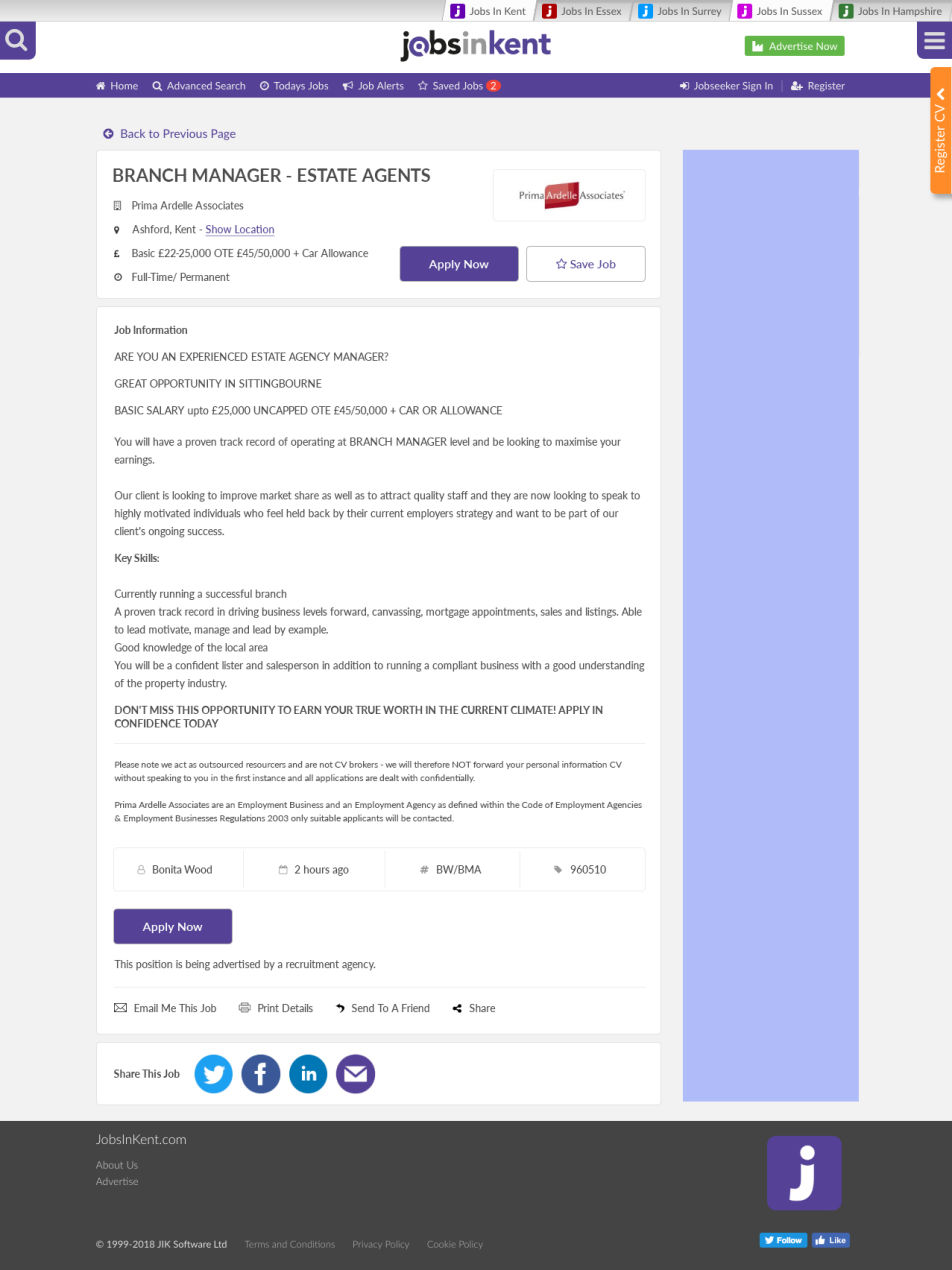
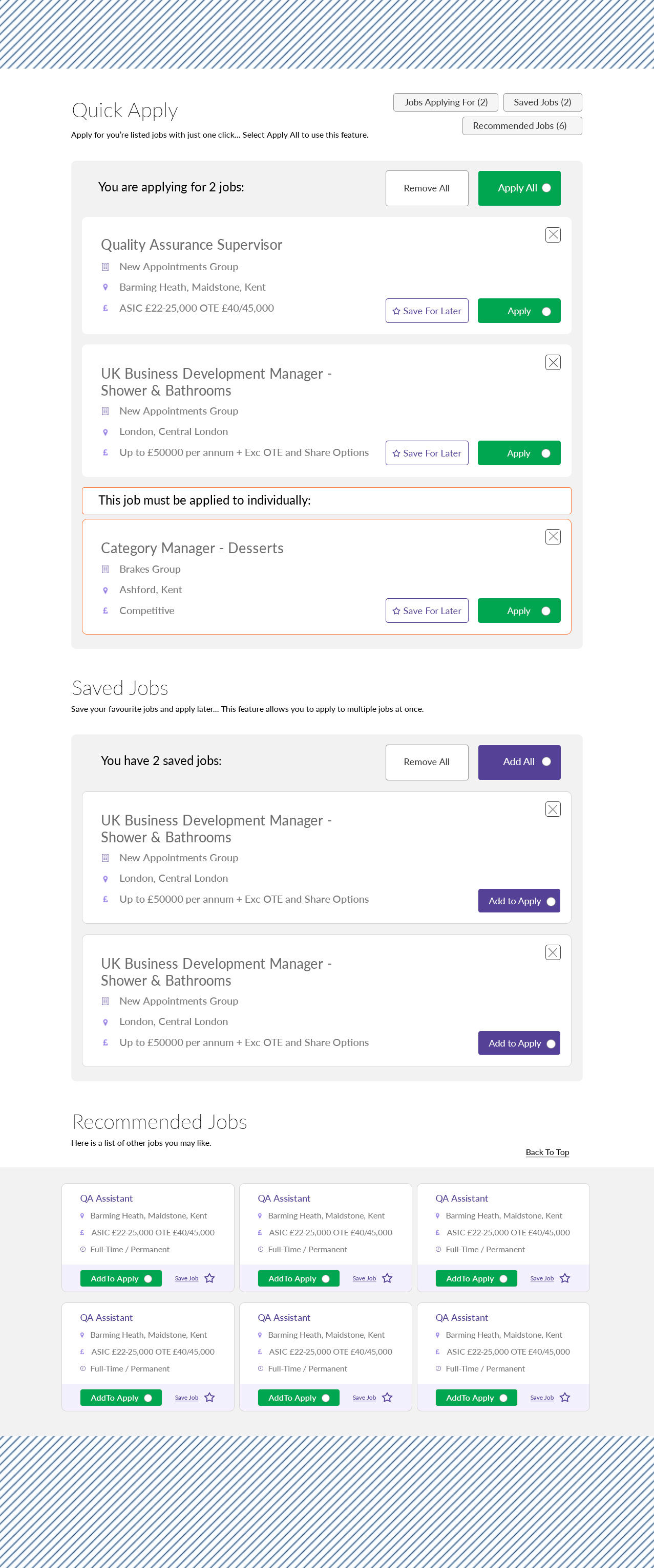
This project aims to revolutionise the job application experience for our users by creating a comprehensive and intuitive Dashboard. Currently, user research indicates that individuals typically apply for only one or two jobs per visit, largely due to inefficient website features. Our vision is to transform this by providing a powerful, centralised hub where users can manage all their job-seeking activities in one place - applications, saved listings, and even discover new opportunities.

The core objective is to foster increased user engagement and streamline the application process. By implementing an optimised Dashboard with enhanced functionality, we aim to empower users to apply for multiple roles more efficiently, track their progress seamlessly, and ultimately, enhance their chances of finding the perfect job.

Collaborating:

This project thrived on collaboration. I worked closely with JIK's team of developers, designers, and analysts on a daily basis. These interactions were crucial to understanding the intricacies of the existing website infrastructure, identifying potential limitations, and ensuring the feasibility of proposed improvements.

Responsibilities:

My primary responsibility was to design a simplified and effective system that empowers users to apply for multiple jobs simultaneously. This system needed to provide a centralised location for users to effortlessly track both their job applications and saved job listings. I focused on crafting an intuitive jobs panel and a user-friendly dashboard, meticulously optimised for both desktop and mobile platforms. The goal was to achieve a clean, streamlined interface that significantly improves the overall user experience, making the job search process more efficient and rewarding.

Job listings panel original

Saved Jobs Dashboard.

Streamlining Your Job Search.

The Challenge:
Our original job application process was cumbersome. Users had to navigate multiple steps to save and apply, leading to a significant drop-off rate. Research revealed the lengthy form-filling required for each application was a major deterrent, limiting users to applying for only one or two jobs per week and ultimately hindering their success.

The Solution:
A Streamlined, Centralised Dashboard, with the need to simplify the application process and keep everything in one easily accessible location. The goal was to enable job seekers to apply for more positions with minimal click-throughs and repetitive form submissions.

Previously:

Panel:

The listings panel effectively presented relevant job opportunities based on keyword searches.

Data:

Data indicated low user engagement due to the perceived length and tedium of the application process, discouraging users from fully utilising the website.

Revamped Dashboard

The previous dashboard felt like a cluttered maze. Now, stepping into this revised version feels like entering a streamlined command center! You can quickly view recommended jobs tailored to your keywords, you can track my application progress and access important notifications without endless clicking. It has been designed to be intuitive, making the whole job search process feel less daunting. This new design is a game-changer; it truly understands what job seekers need to stay motivated and on track!

Mobirise

Updated Page Breakdown

As the UX lead on the Jobs in Kent project, I focused on creating a more intuitive and efficient user experience. The goal was simple: eliminate unnecessary steps and empower job seekers to find and apply for the right roles quickly. That's why I designed a central dashboard, a one-stop-shop for everything a user needed, removing those frustrating multiple click-throughs.

The heart of this dashboard was the Quick Apply Panel. I wanted to make applying for multiple positions as easy as possible. My solution? The "Apply All" feature. A feature that had never been implemented on recruitment website before. Users could select a bunch of jobs and fire off their applications in one go. Of course, they could still apply individually if they preferred. And for those roles that needed a bit more thought, a "Save" function automatically moved jobs to the Saved Jobs Panel for later consideration. I even highlighted roles needing extra attention, like those requiring cover letters or additional information, in a distinct orange colour.

To keep everyone oriented and on track, I implemented Quick Tab Links at the top right. These clearly labeled tabs made navigating between job applications, saved jobs, and recommended openings a breeze. They served as handy shortcuts, allowing users to jump to the section they needed in an instant.

Speaking of the Saved Jobs Panel: this was where users could revisit those nearly-but-not-quite-there opportunities. Saving a job immediately highlighted the "Saved Jobs" tab at the top, providing a visual reminder. To move a saved job to the application stage, the user simply selected "Add to Apply," transferring the job to the Quick Apply Panel. And, of course, users could easily delete jobs they no longer wanted.

Finally, the Recommended Jobs Panel was designed to surface new and relevant opportunities that users might have missed. The call-to-action buttons within this panel worked seamlessly with the others. "Add to Apply" moved the job to the Quick Apply Panel; "Save" moved it to the Saved Jobs Panel - a cohesive and intuitive system.

After completing the UX design, close collaboration with the design team ensured a smooth handoff.

A few months later, I circled back with Jobs in Kent to learn about the impact of the new features. To my immense satisfaction, the CEO shared some incredible news: a fourfold increase in results! The new features were a resounding success, not only for Jobs in Kent but, more importantly, for job seekers navigating the often-challenging search for their next role. 

Looking back, it's incredible to see how a single idea can ripple through an industry.
A few years ago, I launched the "One Click All" application feature, aiming to simplify the job-seeking process for candidates. The response was overwhelmingly positive, streamlining countless applications and connecting talent with opportunity more efficiently.

Now, seeing other recruitment platforms embracing similar "Apply All" solutions fills me with immense pride. It validates the initial vision and reinforces the importance of constantly innovating to improve user experience. Knowing that my initiative has contributed to a more accessible and efficient job market for everyone is truly rewarding. It motivates me to continue pushing boundaries and developing solutions that benefit both job seekers and employers alike.

© Copyright 2025 Eugene Stickney - All Rights Reserved

Mobirise